We’re going to talk about themes for WordPress.
Themes are the most important factor in controlling how your site looks. Themes are installed in the same way as plugins, but there are some major differences. For example, many plugins can be installed and activated at the same time. Only a single theme can be active at one time.
After this chapter, you will be able to:
- Find themes.
- Install and use themes.
- Analyze themes.
- Disable and delete themes.
with the help of following featues …
- Finding Themes in WordPress
- Installing Themes in WordPress
1. Finding Themes in WordPress
So far in this page, we’ve been using a single theme. Let’s see where that theme is located in our site:
- Go to “Appearance” and then “Themes”.
- You’ll see at least three themes (some hosting companies may add more themes).

These themes are released almost every year. We’re using “Twenty Seventeen”, for the simple reason that I prefer it and think it’s more useful for beginners. The “Twenty Nineteen” theme is a little too plain and boring, in my humble opinion. Oh, and for the first time in many years, the WordPress team didn’t release a theme in 2018 so there is no “Twenty Eighteen”.
These themes are not really intended for professionally designed sites but are for demonstration purposes. They showcase many of the default features in WordPress and make a good starting point for beginners.
If you want to change the design of your site, the place to go is https://wordpress.org/themes/. This operates in a very similar way to the Plugin Directory we saw earlier in the book. There are 1,000’s of themes to choose from, and all of them are free.
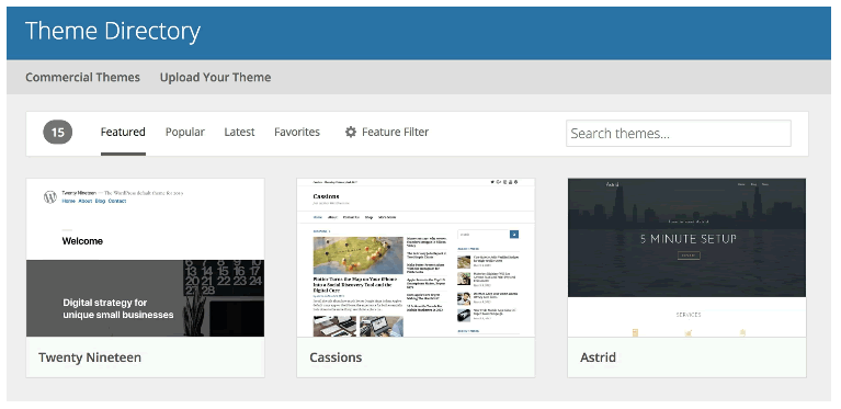
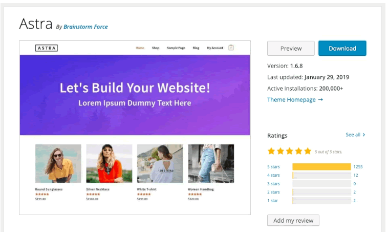
If you click on one of the themes, you get a better picture, as well as a description of the theme. The layout of these screens is slightly different from the plugins, but you’ll see lots of the same details, including “Last updated”, “Active Installs”, and “Ratings”.
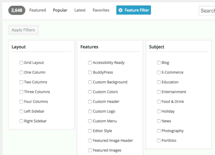
If you’re looking for a particular kind of design, the “Feature Filter” will be very useful. For example, this allows you to select whether a theme has one, two, three, or four columns. You can also select what kind of style you want: blog, e-commerce, news, portfolio, or something different.
In addition to all the free themes, there are also commercial themes: https://wordpress.org/themes/commercial/
These are themes that you pay for. They cannot be downloaded from WordPress.org or from within your WordPress site.
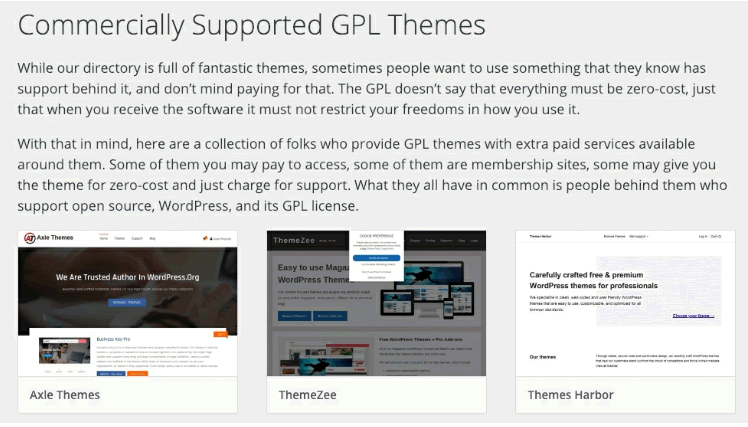
Notice the detailed description on top of this page? “GPL” is the license used for WordPress code. It says that it’s fine to charge people for your code, but you can’t restrict what they do with that code. In many cases, what you actually pay for from these commercial theme providers is support. They can help you to get the theme configured properly and whenever you get stuck.
What’s different about commercial themes is that usually you buy them and then download a compressed file. To install commercial themes, you go to the “Themes” page, click “Add New” and use the “Upload Theme” button.
2. Installing Themes in WordPress
Let’s go through the process of installing a free theme. This process is very similar to installing plugins.
- Go to “Appearance” and then “Themes”.
- Click “Add New”.
- As you are searching for a theme, you can see what they may look like on your site. Click the “Preview” button:

- For our Wordville site, we’re going to use a theme called Astra. Search for “Astra”.
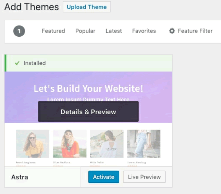
- Click “Install” and then “Activate”:
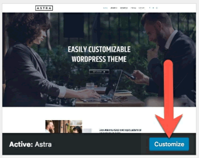
- Click the “Customize” button for Astra:
- You will now see Astra inside the Customizer area:
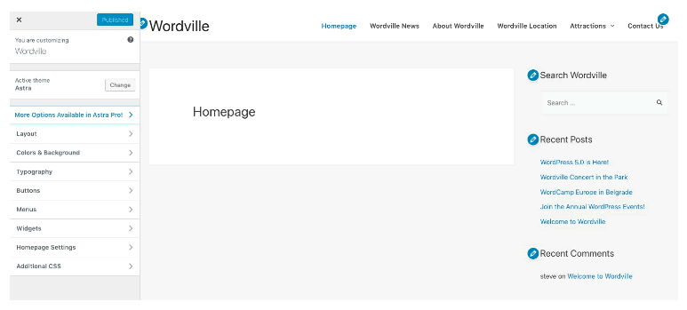
The options contained within the Customizer do vary from theme to theme. Some themes have dozens of options here, and some themes have just a few.
The next step in our site-building process will be to use the Customizer to design the Astra theme. Let’s walk through the steps one-by-one until we get a great-looking site.
None of these changes go live until you click “Publish”. The Customizer allows you to make changes and view them in your own site with your own content before committing those changes.
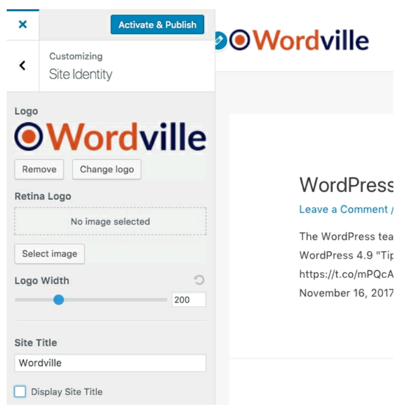
- Click “Layout”, then “Header”, then “Site Identity”.
- For the logo, upload the wordville-logo.png file from /astra-redesign in the Resources folder. Don’t crop the logo when you upload it.
- Uncheck the box “Display Site Title”.
- Modify the “Logo Width” option until the logo fits nicely on your site:
- For the Site Icon option, you can use the same image we chose earlier in the book for the Twenty Seventeen theme. That file was called wordville-logo.png. You might have noticed that we now have two images called wordville-logo.png. WordPress does not have a problem with that and you can safely upload multiple files with the same name.
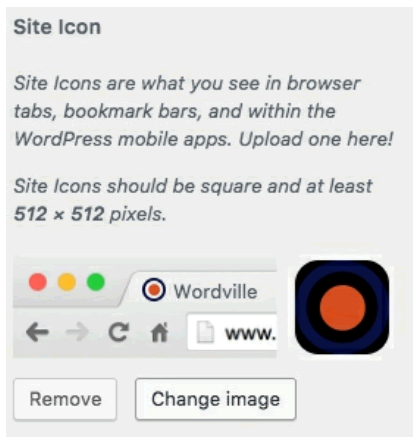
Next, let’s update the color scheme to match our site’s logo:
- Click the back arrow next to “Site Identity”.
- Click the back arrow next to “Header”.
- Click the “Colors & Background” link.
- Click “Base Colors”
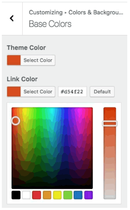
- Change “Theme Color” to a new color: #d54f22. This is the same orange color used in the logo:

- Change the “Link Color” to #d54f22 also.
One thing you may notice is that there’s less room for the menu in this theme, compared to the previous theme. If you narrow your browser window, you’ll see that your menu will break onto a new row when the width is too narrow:

We can fix this problem by tweaking the text in the menu links to make them shorter.
- Click “Menus” and then “Main Menu”.
- Inside each menu link, shorten the title. For example, “Homepage” can be reduced to “Home”.
- After updating each menu link, click the up arrow in the top-right corner of the box to minimize the settings for that link.

- Keep doing this until all your menu links use just a single word:

What else can we do to use the Astra theme as well as possible? We can certainly improve the footer area.
- Click the back arrow next to “Menus” so you go up to the top level of the settings.
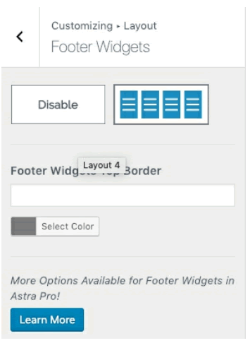
- Click “Layout”, then “Footer”, then “Footer Widgets”.
- Choose the four column layout for the footer:
- Click the back arrow so you go up to the top level of the settings.
- Click “Widgets”.
- You’ll now see four footer areas:
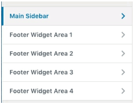
- Open each of the four widget areas and add a widget. I have some suggestions for you in the screenshot below, but at this point you should be feeling more confident in your own judgement about WordPress. Use this opportunity to experiment with different widgets:

Finally, you might want to improve the footer which contains the copyright information at the very bottom of the page.
- Click the pencil icon shown below:

You can use this opportunity to remove the “Powered by Astra” text if you don’t find that useful:
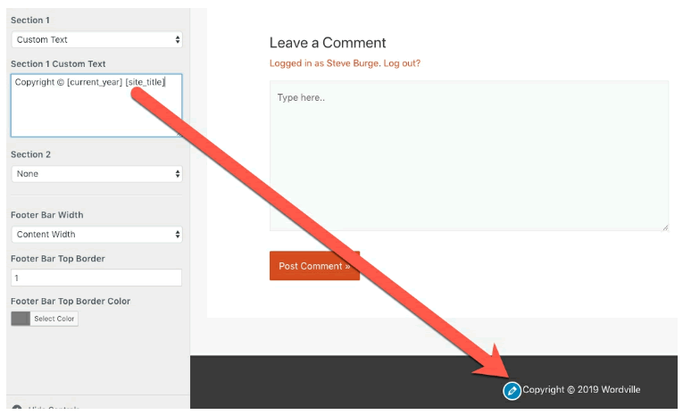
As with the widgets, feel free to play around with Astra’s settings. Do some experimentation and see which features you like.


